Introduction
In an era saturated with information and visual stimuli, brands face the ongoing challenge of distinguishing themselves and remaining memorable. The design of a magazine is a powerful vehicle for establishing a distinctive brand identity that resonates deeply with its audience. By implementing consistent and deliberate design choices, brands effectively communicate their core message and build enduring relationships with their readers.
Consistency in design transcends mere aesthetics to cultivate instant recognition and foster loyalty, thereby establishing a foundation of trust. This trust assures readers that the quality and essence of the brand remain constant, regardless of the publication. This article explores the essential components necessary for creating a consistent brand identity through magazine design.
The Importance of Consistency in Design
Consistency is the cornerstone of a robust brand identity. It ensures that all visual elements are aligned and synergistic, reinforcing the brand’s message with each reader interaction. When you print your magazines, adopting a consistent design approach guarantees that each issue is recognizable and instantly associated with the brand, thereby building trust and credibility among your audience.
A uniform design language also leaves a lasting imprint on consumers. It acts as a non-verbal pledge of quality and reliability, promising readers an engaging and familiar experience with each publication. Consistency helps transform a magazine from a collection of disparate pages into a holistic narrative that resonates with the brand’s identity.
Aligning Visual Elements to Brand Identity
Visual elements are instrumental in expressing a brand’s identity, serving as the visible embodiment of its core values and messages. Each component must reflect and enhance the brand’s public persona from image selection to graphic design. A consistent alignment of visual elements aids not only in recognition but also significantly differentiates the brand from competitors in a crowded marketplace.
Each photograph, illustration, or graphic should be thoughtfully curated to represent the brand’s personality and ethos accurately. Whether the design language is sleek and minimalist or vibrant and dynamic, maintaining a unified visual approach reinforces the reader’s connection to the brand, delivering a subconscious understanding of the brand’s underlying message.
The Role of Typography in Brand Recognition
Though often overlooked, typography is a potent instrument in defining brand recognition. The choice of typeface, including font style, size, and layout, communicates subtle yet significant cues about the brand’s character and positioning. A modern sans-serif font might suggest contemporary innovation, while a traditional serif typeface could evoke a sense of authority and longevity.
Consistent typography cultivates brand recognition by creating a visual lexicon that delivers the brand’s message before a single word is read. When a brand adheres to a defined typographic style, it establishes a visual continuity that facilitates immediate identification and perception. This results in a stronger emotional connection between the brand and its audience.
Using Color Schemes Strategically
Colors are powerful emotional triggers, making them crucial to brand identity. A thoughtfully chosen color scheme can evoke specific emotions and associations that the brand desires. It is imperative to select colors that reflect the brand’s personality and ethos, aligning with its overarching narrative.
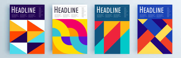
Consistent use of color schemes across all magazine designs guarantees that the visual identity remains cohesive and immediately recognizable. Whether the palette consists of calming pastels or energetic brights, colors provide a sense of unity and familiarity, inviting readers to associate their emotional responses directly with the brand.
Creating a Cohesive Layout
The layout of a magazine is where all design elements converge. A cohesive layout ensures that each page adheres to the brand’s design standards, facilitating a seamless reading experience. Consistent grid systems, margin styles, and spacing rules contribute to a clean, organized appearance that guides the reader’s journey.
A well-crafted layout ensures content flows naturally and intuitively, creating a pattern readers can comfortably navigate. Familiarity with the layout encourages engagement, reinforcing the brand’s identity with each page turn and enhancing the credibility and authority of the publication.
Enhancing Engagement through Design
An engaging design captivates and holds the reader’s attention, transforming passive browsing into active engagement. Consistent brand design is vital in fostering this engagement by offering a reliable and pleasurable visual journey. When readers recognize what to expect consistently, they are more likely to remain invested in the content.
Integrating interactivity, thoughtful design elements, and well-curated content contributes to a magazine’s ability to engage its audience. In synergy with a consistent brand identity, these elements invite readers to become regular consumers of the brand’s vision and message, cementing a loyal readership.
Conclusion
Establishing a brand identity through magazine design requires a delicate balance between creativity and consistency. Every design component, from typography to layout configuration, must harmonize to convey a unified message that resonates with readers. By prioritizing consistent design choices, brands can build recognition, trust, and loyalty, maintaining a prominent place in their audience’s minds and hearts.
Ultimately, the power of consistency lies in its ability to transform a magazine into a compelling narrative that articulates the brand’s values and vision with clarity and purpose. Through meticulous design, brands do more than publish a magazine; they curate an experience that encourages their audience to return repeatedly.